Product Page Structure:
The Blueprint That Converts

Discover the exact section-by-section layout used by the highest-converting eCommerce product pages — with design rationale for every element.

📚 Foundation Module
12 min read
📈 Avg. +42% CR lift

The 9-Section Product Page Blueprint

Every section below serves a specific role in moving a visitor from curiosity to purchase. Remove one and you create a leak in your conversion funnel.

1
Above the Fold

Hero Section: Image + Headline + Price

The first viewport must communicate your product's value proposition instantly. High-resolution imagery, a benefit-led headline, visible price, and a dominant CTA. No distractions.

Critical Zone — 0–3 sec decision
2
Product Media

Image Gallery & Video

Multiple angles, lifestyle shots, size-reference images, and a short demo video. Customers who can't touch the product need to see it from every angle. 360° views increase conversion by up to 27%.

Visual trust builder
3
Buy Box

CTA, Variants & Quantity

The buy box is your highest-value real estate. Contains: variant selector, quantity input, primary CTA, secondary CTA (wishlist), and micro-trust signals (free shipping threshold, returns badge).

Conversion engine
4
Trust Signals

Rating Summary + Badges

Immediately below or adjacent to the buy box. Star rating with review count, security badges, payment icons, and return policy guarantee. Reduces purchase anxiety at the critical decision point.

Anxiety reducer
5
Product Detail

Description & Key Benefits

Lead with benefits, not features. Use short paragraphs and scannable bullet points. Answer "what will this do for me?" before "what is this made of?" Maximum 3–4 benefit bullets above the fold of this section.

Consideration zone
6
Features

Specifications & Features Grid

For considered purchases, a scannable grid or table of technical specifications helps comparison shoppers commit. Use icons, short labels, and progressive disclosure for technical detail.

Rational validation
7
Social Proof

Full Review Section

Star distribution breakdown, filter options, verified purchase badges, and photo reviews. Place a "sticky" mini-CTA at this depth so re-convinced customers don't have to scroll back up to purchase.

Bottom-funnel converter
8
Discovery

Cross-sells & Related Products

Show relevant complementary items ("pairs well with") or category alternatives. This section captures visitors who didn't convert on the primary product. AOV lift opportunity.

Revenue maximiser
9
FAQs

Frequently Asked Questions

Address the top 5–8 objections proactively. Shipping time, sizing, materials, warranty, compatibility. Each answered FAQ removes a reason not to buy. Use structured data for SEO bonus.

Objection handler
Product Features List Design
✦ Benefit-led copy
✦ Icon-backed features
✦ Scannable layout

How to Design the Features Section

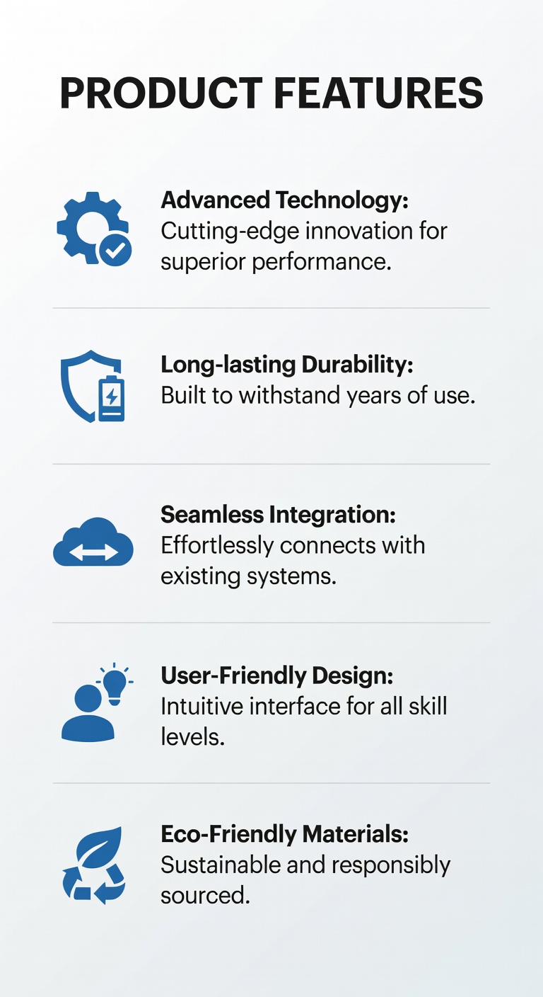
A well-designed features section converts rational shoppers who need to justify their purchase. The goal is to make complex information feel simple.

🎯
Benefits before featuresStart with what the product does for the customer — not its technical specifications. "Stays cold for 24 hours" before "double-wall vacuum insulation."
📋
3-column icon gridPresent features in a 3-column grid with icons. Scannable, visually balanced, and works on mobile when stacked to 2 or 1 column.
✂️
Limit to 6 core featuresChoice paralysis applies to features too. Highlight 6 critical differentiators. Link to a full specs sheet for power users who want everything.

Why Product Video Converts

Video is the closest thing to an in-store demonstration. Pages with product video see an average 80% increase in purchase intent compared to image-only pages.

  • Keep it under 60 seconds. Attention drops sharply after the first minute. Front-load the strongest visual hook in the first 3 seconds.
  • Autoplay without sound. 85% of social video is watched without sound. Use captions and strong visual storytelling.
  • Place in the image gallery slot. Position video as the second or third "image" in your gallery carousel — discovered naturally during product exploration.
  • Show, don't tell. Demonstrate the product in actual use. UGC (user-generated content) video outperforms polished studio video for trust.
Product Video Demo Example

Product Page Structure: Do's & Don'ts

Do This

  • Lead with a single, benefit-focused headline above the fold
  • Show the price prominently — hidden pricing kills trust
  • Place your primary CTA in the top 50% of the page
  • Use social proof (review count + star rating) within the buy box
  • Include a secondary sticky CTA that appears on scroll
  • Structure the page as a logical narrative: want → proof → buy
  • Use white space to create visual breathing room between sections
  • Offer a persistent cart summary on desktop for long pages

Don't Do This

  • Don't bury the CTA below product specs or descriptions
  • Don't use generic feature descriptions ("High quality materials")
  • Don't display reviews only on a separate tab — they get ignored
  • Don't use auto-playing video with sound — immediate page abandonment
  • Don't stack more than 3 CTAs in the buy box — creates indecision
  • Don't add pop-ups that appear the moment the page loads
  • Don't use low-resolution product images — trust destroyer
  • Don't omit a return policy or make it hard to find

6 Structure Changes That Move the Needle

These tactical adjustments can be implemented without a full redesign and typically show results within the first A/B test cycle.

01

Move reviews above the fold

Display the star rating and review count directly beneath the product title, before the price. Boosts purchase confidence at first glance.

02

Add a sticky buy bar

A fixed bar at the bottom (mobile) or top (desktop) containing the product name, price, and CTA keeps the purchase path visible at all times.

03

Collapse specs behind accordions

Long spec lists intimidate casual browsers. Use accordion UI to show specs on demand while keeping the page lean and scannable by default.

04

Add a mini FAQ module

Place 3–4 quick-answer FAQs directly in the buy box area (shipping, returns, sizing). Answers the most common pre-purchase questions without leaving the page.

05

Show a "Recently Viewed" strip

Gives returning visitors a quick path back to products they were considering. Reduces re-navigation friction and improves multi-session conversion.

06

Use urgency near the CTA

"Only 3 left" stock indicators, "Ships today if ordered by 3pm" notices, and limited-offer banners — placed near (not replacing) your CTA — accelerate decisions.

Next: Design What Happens Above the Fold

Your page structure is set — now learn how to design the critical first viewport that either earns the scroll or loses the customer forever.

Above-the-Fold Design →
Saved to your library.