Visual Hierarchy:
Guide the Eye to the Buy Button

Typography, colour, contrast, and spacing are the invisible architecture of your product page. Learn how to arrange every element so the shopper's eye travels naturally toward conversion.

๐Ÿ‘๏ธ Design Module
โฑ 11 min read
๐Ÿ“ˆ Avg. +29% scroll depth

The Conversion Typography Scale

Every text element on your product page has a visual weight. The right scale creates a clear reading hierarchy that guides attention from the headline to the CTA.

H1 โ€” TitleDisplay / 38โ€“48px
Premium Chair
Product name. Highest visual weight. Benefit-led. Max 8 words.
PriceDisplay / 32px
$329.00
Most-scanned element. Large, bold, visible colour. Never hidden.
H2 โ€” SectionHeading / 26px
Key Benefits
Section dividers. Clear hierarchy break. Scannable at speed.
H3 โ€” FeatureSub-head / 20px
Ergonomic Support
Feature titles, review headers. Readable within feature lists.
BodyRegular / 16px
Designed for all-day comfort with lumbar support and adjustable armrests. Built to last with premium materials.
Descriptions, review text. Min 16px. Line-height 1.6โ€“1.8.
CaptionSmall / 13px
โœ“ In stock ยท Free shipping ยท Ships in 2โ€“3 days
Shipping info, secondary details. Muted colour. Never critical info.
LabelMicro / 11px
๐Ÿ”’ Secure Checkout
Badge labels, category tags. All-caps + letter-spacing for legibility.

Choosing Colours That Convert

Colour is your most powerful visual hierarchy tool. The wrong palette confuses the eye โ€” the right one guides it directly to the conversion point.

Primary Text#1a2e1a
Headlines, prices, key info
CTA Green#4a7c59
Buy button, links, accents
Star Rating#f5a623
Stars only. Psychologically warm.
Background Alt#eef5ee
Section breaks, cards, badges
Muted Text#5a6e5a
Descriptions, secondary info

CTA Contrast โ€” Good vs. Bad

โœ“ High Contrast โ€” Correct

White CTA on a deep green background creates maximum contrast ratio (7:1). The button is unmissable.

โœ— Low Contrast โ€” Avoid

Light green button on a light green background creates almost no visual differentiation. The CTA disappears.

The Shopper's Eye Journey

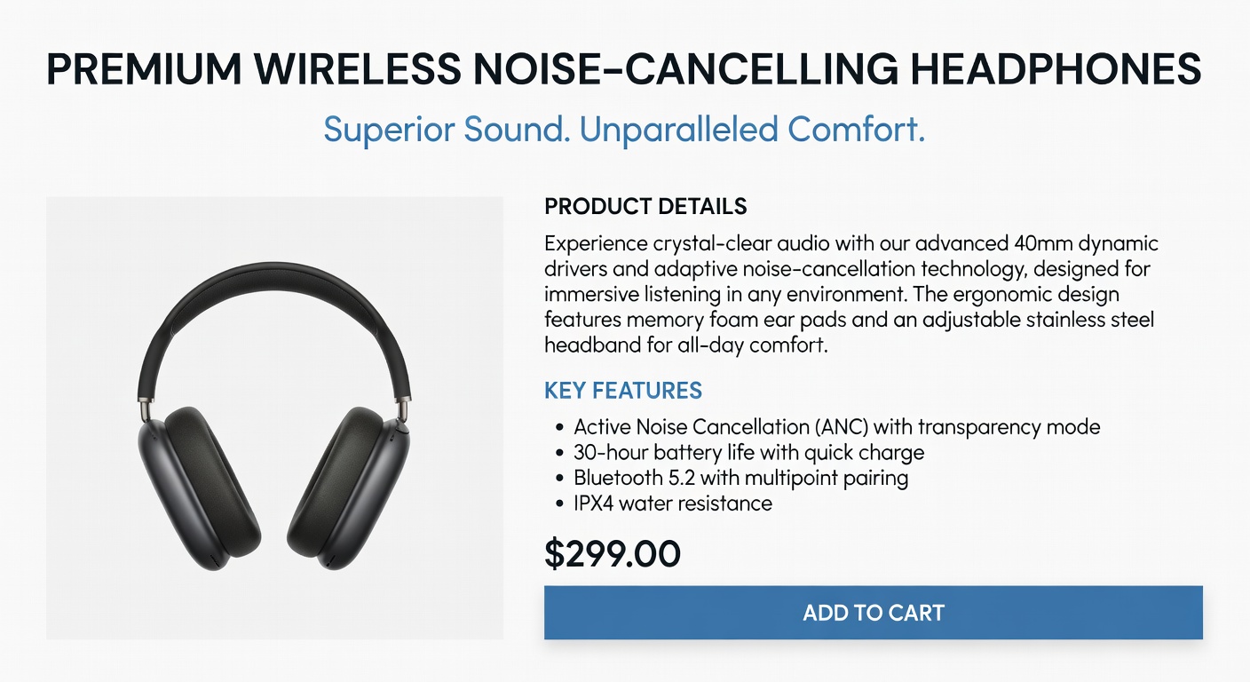
Eye-tracking studies reveal a predictable visual path on well-designed product pages. Your layout should match this natural scanning pattern โ€” don't fight it.

1
Hero image (top-left)The eye lands on the product image first. It must be large, high-quality, and immediately answer "what is this?"
2
Product title (top-right)From image, the eye moves to the largest text element โ€” the headline. Benefit-led title must be immediately scannable.
3
Star rating + priceTwo of the most-scanned elements on any product page. Social validation immediately followed by price anchoring.
4
CTA buttonHigh contrast pulls the eye here. The buy button must visually stand out from everything else on the page โ€” it competes with nothing.
5
Trust signals below CTAAfter the CTA, the eye drops to the micro-trust elements. These validate the decision for buyers who didn't click immediately.
Typography Hierarchy Example Conversion Color Scheme

White Space Is Not Wasted Space

White space is a conversion tool. Properly spaced elements are easier to scan, more trustworthy, and put less cognitive load on the buyer. Use a consistent spacing scale.

8px Inner elements โ€” icon-to-text gap, badge padding
16px Component padding โ€” card inner, list item gap
32px Section elements โ€” card margins, grid gaps
80px Section breaks โ€” creates visual breathing room between content blocks

Key Spacing Rules for Product Pages

โ†’ Double space between sections. A clear visual break tells the brain "new section" and resets attention.
โ†’ Isolate the CTA. Add 24โ€“32px of space above and below the buy button. Nothing should visually compete with it.
โ†’ Use consistent column gutters. 24px gap on desktop, 16px on mobile. Inconsistent spacing signals low-quality design.
โ†’ Don't crowd the buy box. The product name, price, variant selector, CTA, and trust signals should breathe โ€” not be stacked tightly.

Next: Optimise for Mobile Shoppers

You've mastered visual hierarchy โ€” now apply these principles to the 70% of your traffic arriving on mobile devices.

Mobile Optimisation โ†’
โœ…Saved!